- Have any questions?
- +91 96020 93137
- info@worldseoservices.com

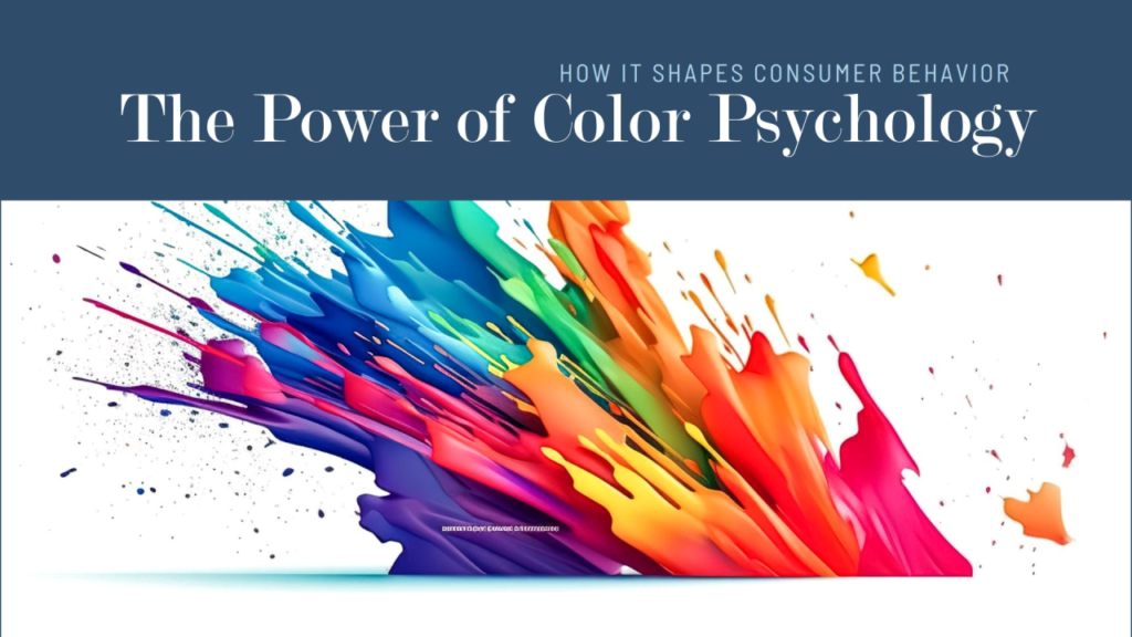
The Psychology of Branding: Colors, Fonts, and Shapes That Influence Customers

Social Media Branding: Strategies for Building a Consistent Online Presence
December 28, 2024
Building a Sustainable Brand: Why Ethics and Transparency Are the Future
December 30, 2024Dive into the science behind design choices that drive consumer behavior and brand recall.
When it comes to branding, the choices you make in design elements like colors, fonts, and shapes aren’t just about aesthetics—they are strategic decisions rooted in psychology. These visual components significantly influence how customers perceive and interact with your brand. At World SEO Services, we understand that mastering the Psychology of Branding is essential for creating a strong, memorable identity that resonates with your target audience.
This guide explores how colors, fonts, and shapes impact consumer behavior and how you can leverage them to enhance your brand.

The Psychology of Branding Explained
Branding is more than just a logo or tagline; it’s the emotional connection between your business and its audience. Every visual element sends a subliminal message to potential customers, shaping their perceptions and decisions.
Key factors include:
- Colors: Trigger emotional and psychological responses.
- Fonts: Convey tone and personality.
- Shapes: Evoke feelings and build associations.
Understanding these elements can help you design a brand that communicates effectively and builds trust.
The Power of Colors in Branding
Colors are among the most impactful elements of branding. They evoke emotions, create associations, and influence purchasing decisions.
1. Red: Energy and Passion
Red is a powerful color that symbolizes excitement, passion, and urgency. It’s often used in branding to grab attention and encourage action.
Example: Coca-Cola uses red to evoke excitement and warmth.
2. Blue: Trust and Reliability
Blue is associated with calmness, trust, and professionalism. It’s a popular choice for industries like finance and technology.
Example: Facebook and LinkedIn use blue to convey trust and community.
3. Yellow: Optimism and Happiness
Yellow is bright and cheerful, symbolizing optimism and positivity. It’s often used to attract attention and create a sense of fun.
Example: McDonald’s uses yellow to evoke happiness and energy.
4. Green: Growth and Harmony
Green represents nature, health, and growth. It’s often used by brands focusing on sustainability and wellness.
Example: Whole Foods Market uses green to align with its organic and eco-friendly ethos.
5. Black and White: Sophistication and Simplicity
Black conveys elegance and power, while white symbolizes simplicity and purity. Together, they create a timeless and classic look.
Example: Chanel uses black and white for a sleek, sophisticated image.
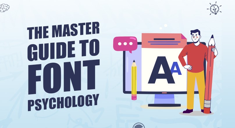
Fonts: Setting the Tone for Your Brand
Fonts play a critical role in branding by influencing how your message is perceived. The right typography can convey authority, playfulness, or elegance.
1. Serif Fonts: Tradition and Trust
Serif fonts, like Times New Roman, are classic and elegant. They convey reliability and tradition, making them ideal for professional brands.
Example: The New York Times uses a serif font to emphasize its authority and legacy.
2. Sans-Serif Fonts: Modern and Clean
Sans-serif fonts, like Arial, are simple and modern. They are often used by tech companies and brands aiming for a clean, minimalist look.
Example: Google’s sans-serif font reflects simplicity and innovation.
3. Script Fonts: Elegance and Creativity
Script fonts resemble handwriting and add a personal, creative touch. They are often used in luxury or artistic branding.
Example: Coca-Cola’s iconic script font enhances its timeless appeal.
4. Display Fonts: Unique and Attention-Grabbing
Display fonts are bold and decorative, designed to make a statement. They’re perfect for headlines or logos that need to stand out.
Example: Disney’s display font is playful and instantly recognizable.
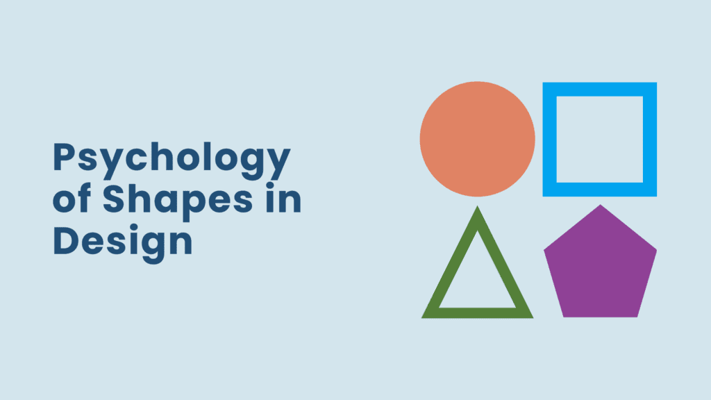
Shapes: Building Emotional Associations
Shapes are another subtle yet powerful tool in branding. They evoke emotions and create subconscious associations.
1. Circles: Unity and Friendliness
Circles symbolize harmony, community, and protection. They are often used by brands that prioritize inclusivity and connection.
Example: Target’s circular logo emphasizes unity and focus.
2. Squares and Rectangles: Stability and Strength
Squares and rectangles convey order, stability, and professionalism. They are commonly used by brands in finance and real estate.
Example: Microsoft’s square logo reflects reliability and structure.
3. Triangles: Innovation and Energy
Triangles represent direction, movement, and innovation. They are often used by brands that focus on growth and change.
Example: Adidas uses a triangle to convey motion and progress.
4. Organic Shapes: Creativity and Nature
Organic, irregular shapes evoke feelings of creativity and naturalness. They are often used by brands in wellness and sustainability.
Example: Airbnb’s logo combines organic curves with modern simplicity to create a sense of belonging.
How to Apply the Psychology of Branding to Your Business
1. Define Your Brand’s Personality
Identify the emotions and values you want your brand to convey.
Action Steps:
Choose colors, fonts, and shapes that reflect this personality.
2. Understand Your Audience
Research your target market to understand their preferences and cultural associations.
Action Steps:
Conduct surveys to gather insights into customer perceptions.
3. Maintain Consistency
Consistency across all platforms is crucial for recognition and trust.
Action Steps:
- Develop a brand style guide that outlines visual and textual standards.
- Ensure your logo, color scheme, and typography are consistent across marketing materials.
Common Mistakes to Avoid
- Overloading with Colors: Too many colors can confuse your audience. Stick to a cohesive palette.
- Inconsistent Branding: Inconsistencies dilute your brand identity.
- Ignoring Cultural Nuances: Ensure your branding elements resonate across different cultural contexts.
